


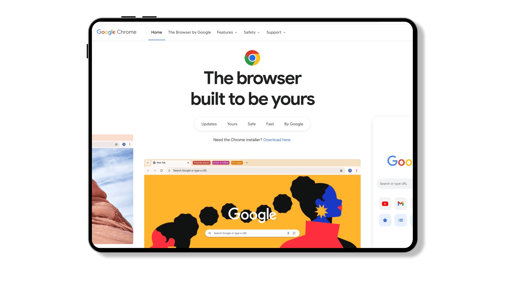
Chrome.com Homepage
Chrome.com, one of Google’s most visited websites with 5 million daily users, revamped its homepage to showcase its latest features. With its dynamic user experience, the new Chrome.com won 2 Webby awards - People’s Voice and Best Responsible/Adaptive Design for Mobile.
Users
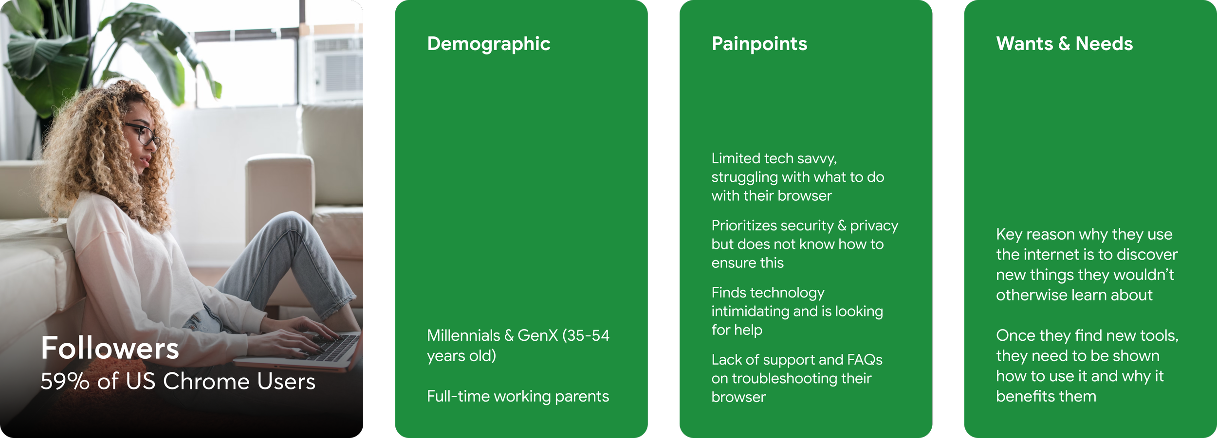
We’ve identified two types of target users - Followers and Power Users. Even though their concerns are similar, the extent and approach are different. We used their distinct characteristics to engage more browser downloads from the Followers and educate the Power Users about Chrome’s newest features.

Challenge
How do we adhere to Google brand design system while pushing it further?
How do we make visitors scroll further down the page?
How do we communicate a large amount of new information in the most engaging way possible?

Approach
A balanced narrative that leverages the strengths of Google as a technology brand and Google as an experience brand.
Vision
Create user-centric narratives that are relatable and reflect everyday needs and benefits of using Chrome.
Art Direction
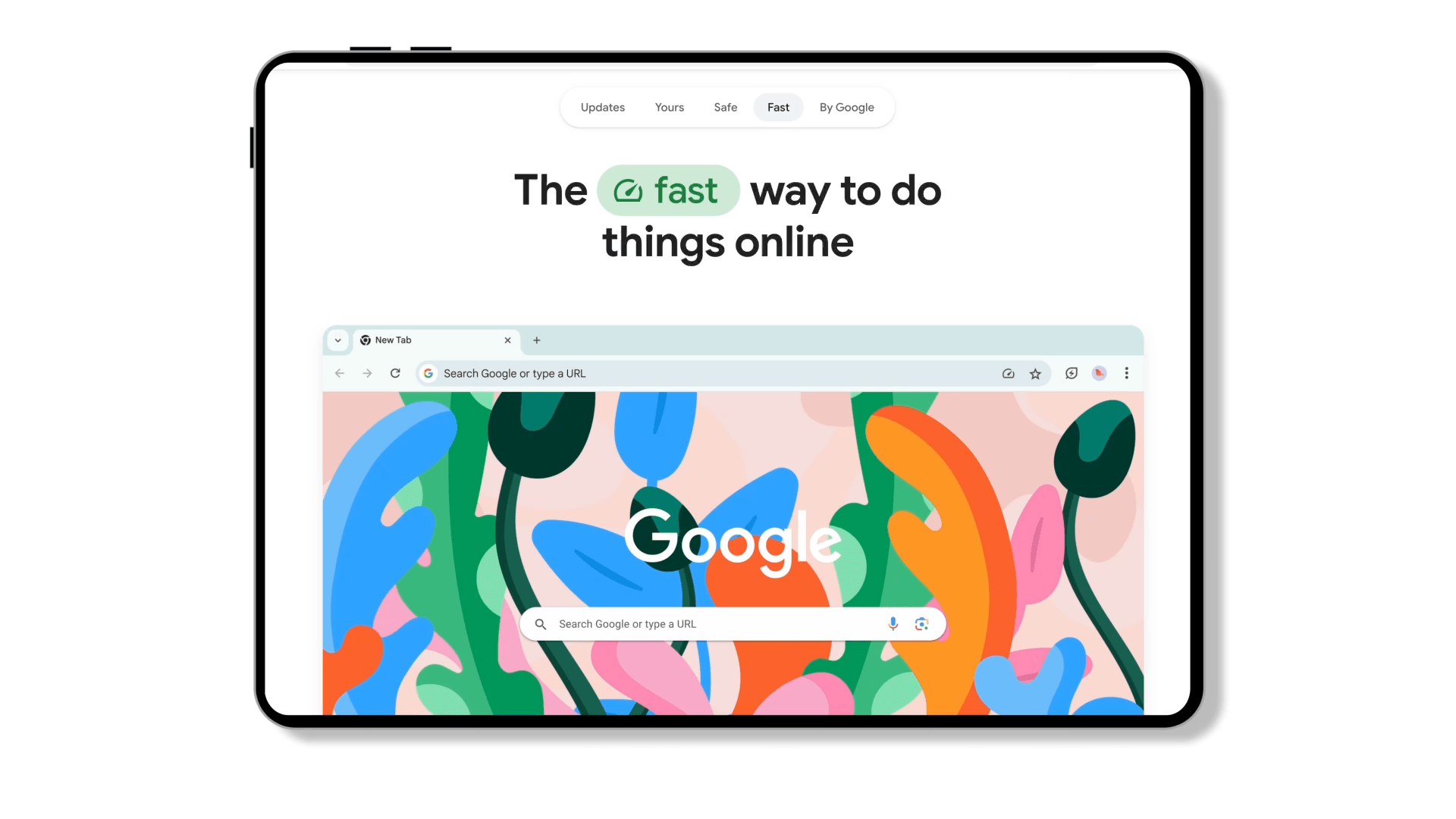
We used dynamic animation to prompt users to scroll downward and tell a story in a more visually interesting way.
New features such as personalization and customization were introduced in a step-by-step format so users could digest the information in a more succinct way.
Bright colours, bold typeface , and short title copy were utilized to increase efficiency and engagement.

Maximize efficiency in content organization
There were a lot of new features and content that we needed to showcase. We included large ‘+’ buttons and carousel arrows to reveal additional information if the user needed to learn more about the features.


Shortcut Links
The shortcut links tab was crucial in guiding users throughout the story. It not only organizes the information by topics, but also allows users could find the content they need in the most efficient way possible.

Team effort
Andres Cardenas Paez
Visual Design Lead
Madison Behringer
UX Designer
Christina Martin
Experience Designer
Katie Spohn
Senior Visual Designer
Josiah Hughes
Writer
Chris Linden
Group Creative Director
Natalia Bejarano
Senior Project Manager
Alejandra Monroy
Associate Creative Director