

Drift
A Canvas of Cannabis Stories
One of the largest cannabis brands in Canada, Aurora Cannabis, came to us with an ask to provide branding for their new entertainment cannabis brand. Drawing inspiration from the fluidity of a drifting cloud, Drift mirrors the ever-changing landscape of personal experiences. From novices to connoisseurs, Drift is a brand that resonates with all, offering a wide range of carefully curated products that cater to every preference.
Overview
Role
Design, Art Direction, Branding Concept

Challenge & Approach
1. Cannabis experiences are not meant to be the same for everyone. How can we have consistent branding while showing the range of cannabis experience?
2. Cannabis advertising regulations are extremely strict and limited. How do we make the visuals stand out while abiding by the rules? (It’s basically like cigarette ads; cannabis ads cannot show people, animals, musical instruments, or anything that implies a “positive effect”.)
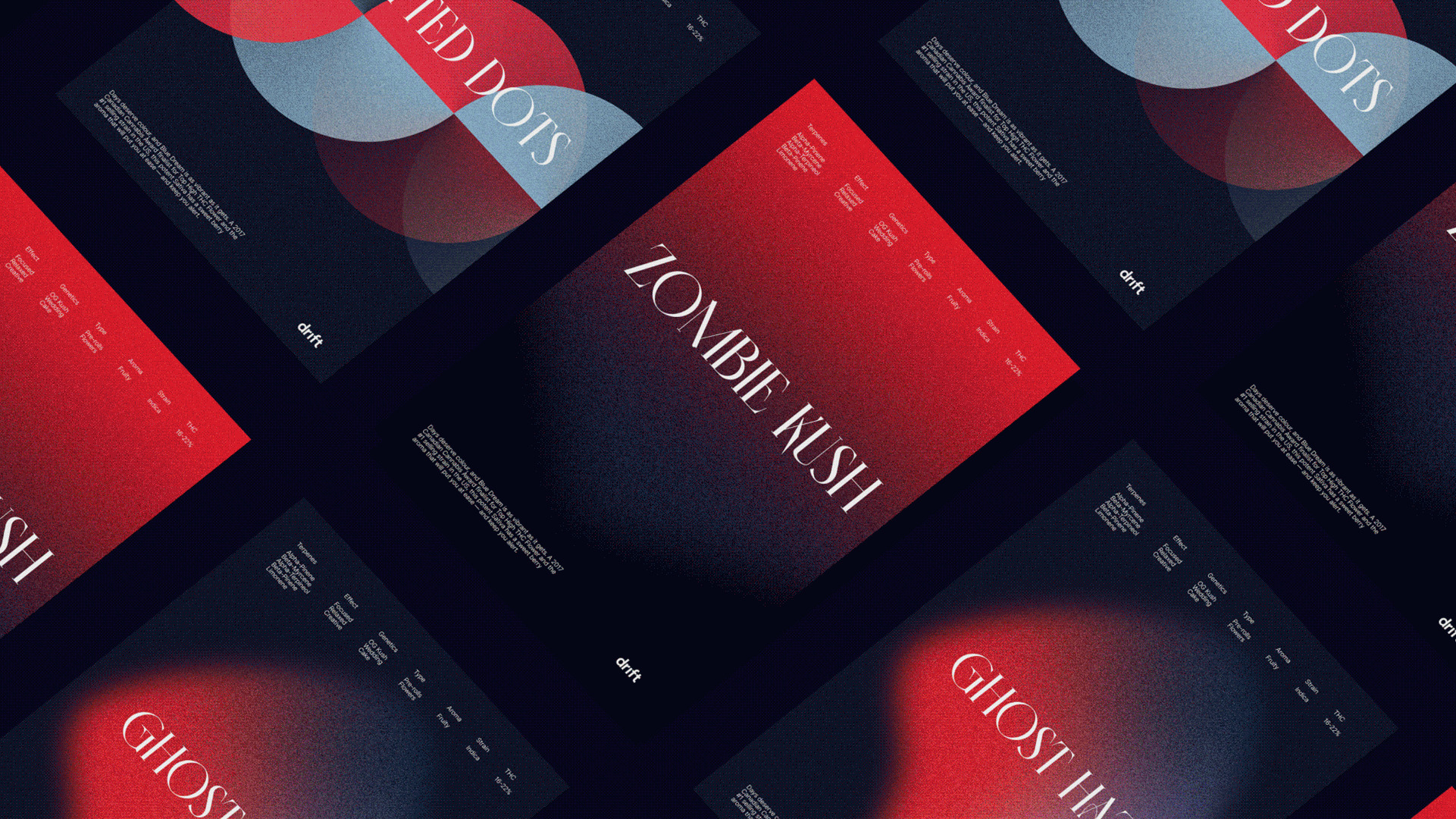
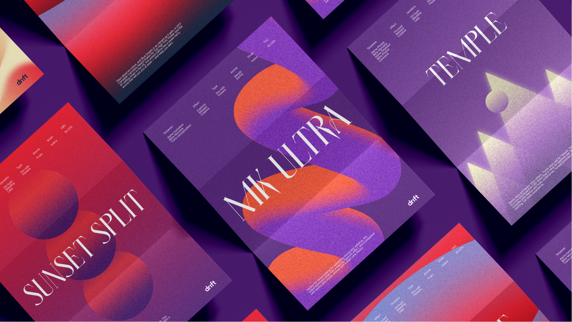
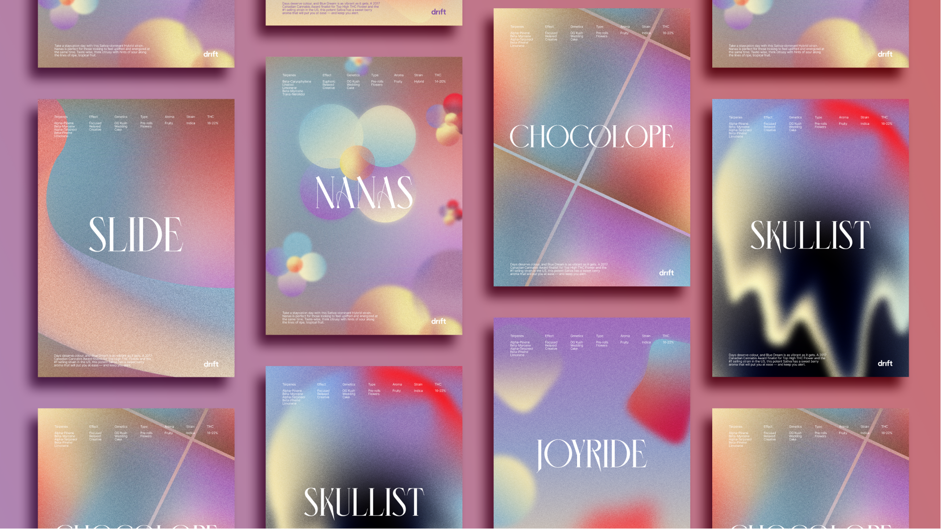
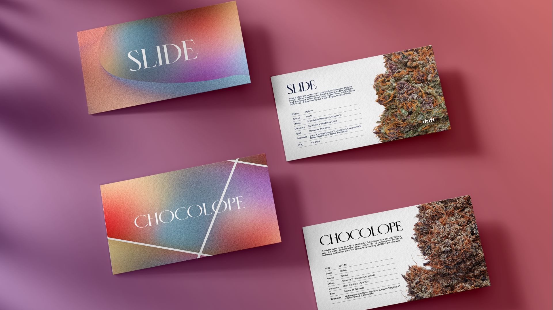
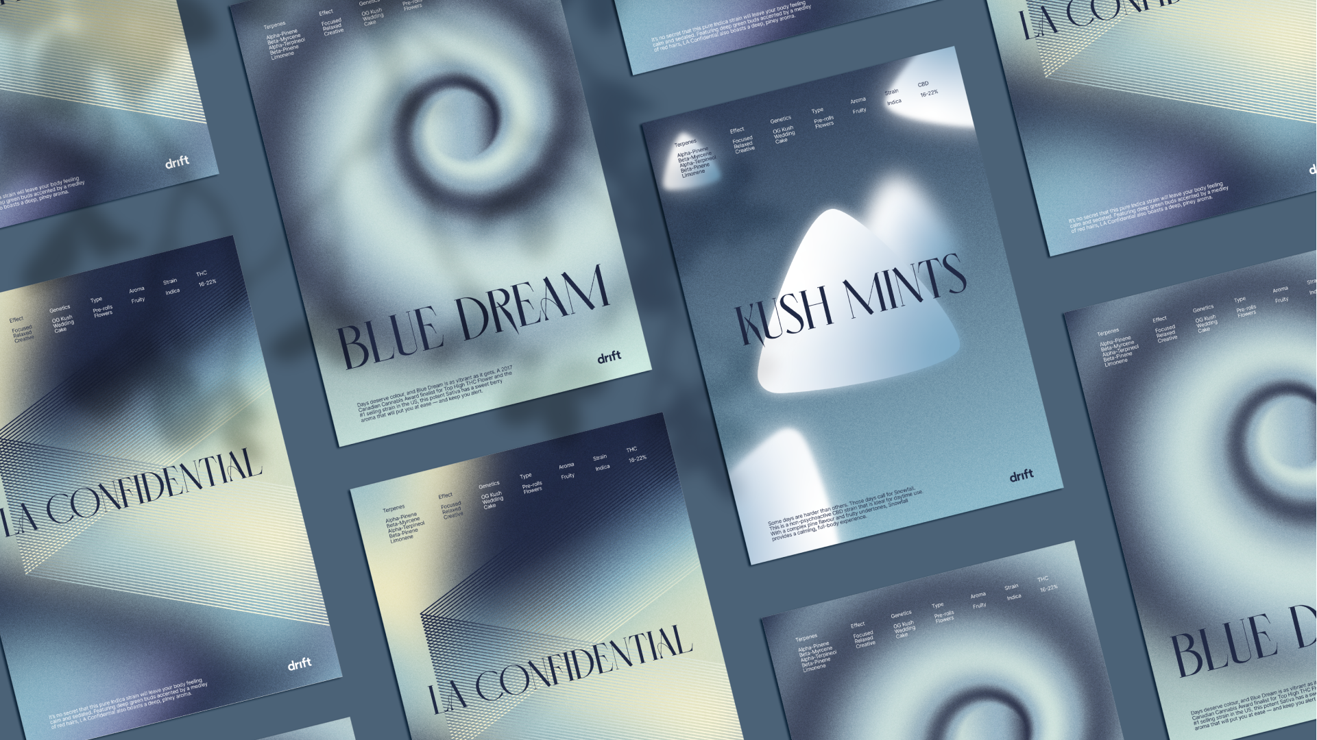
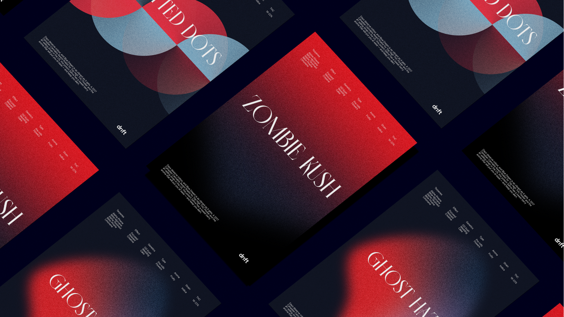
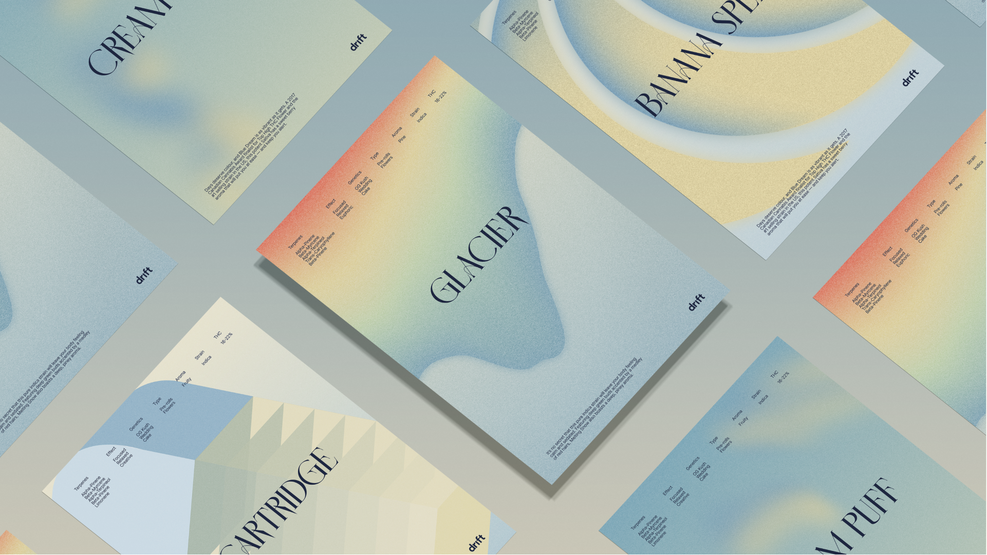
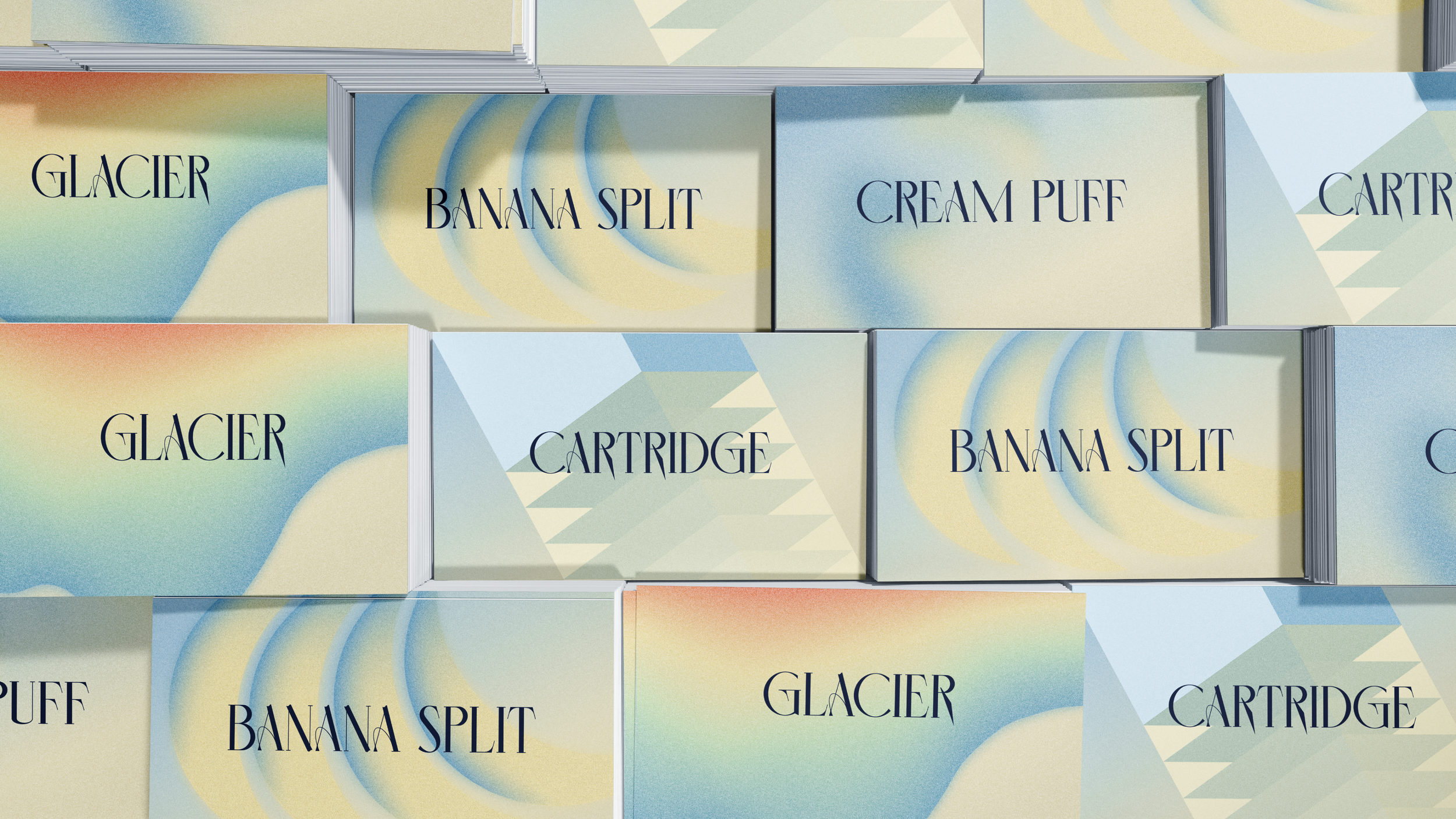
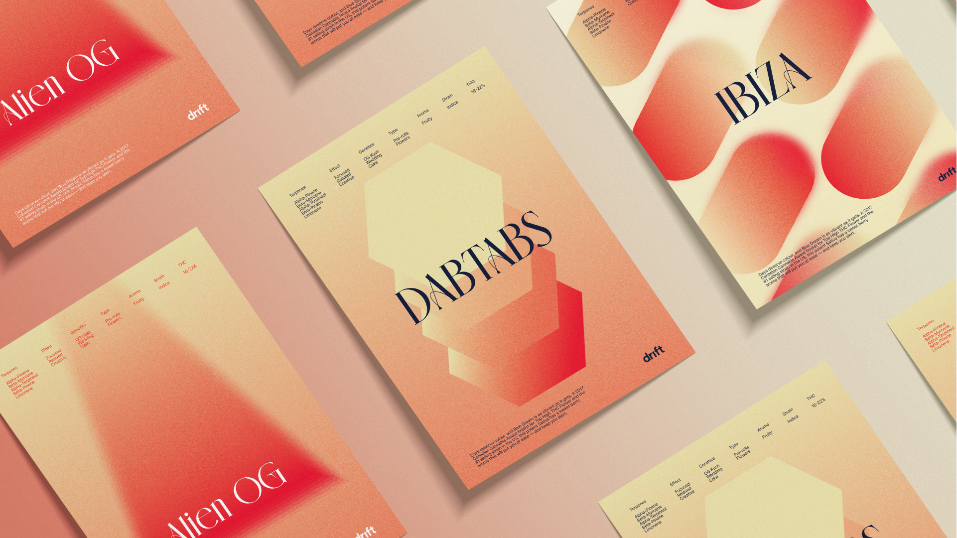
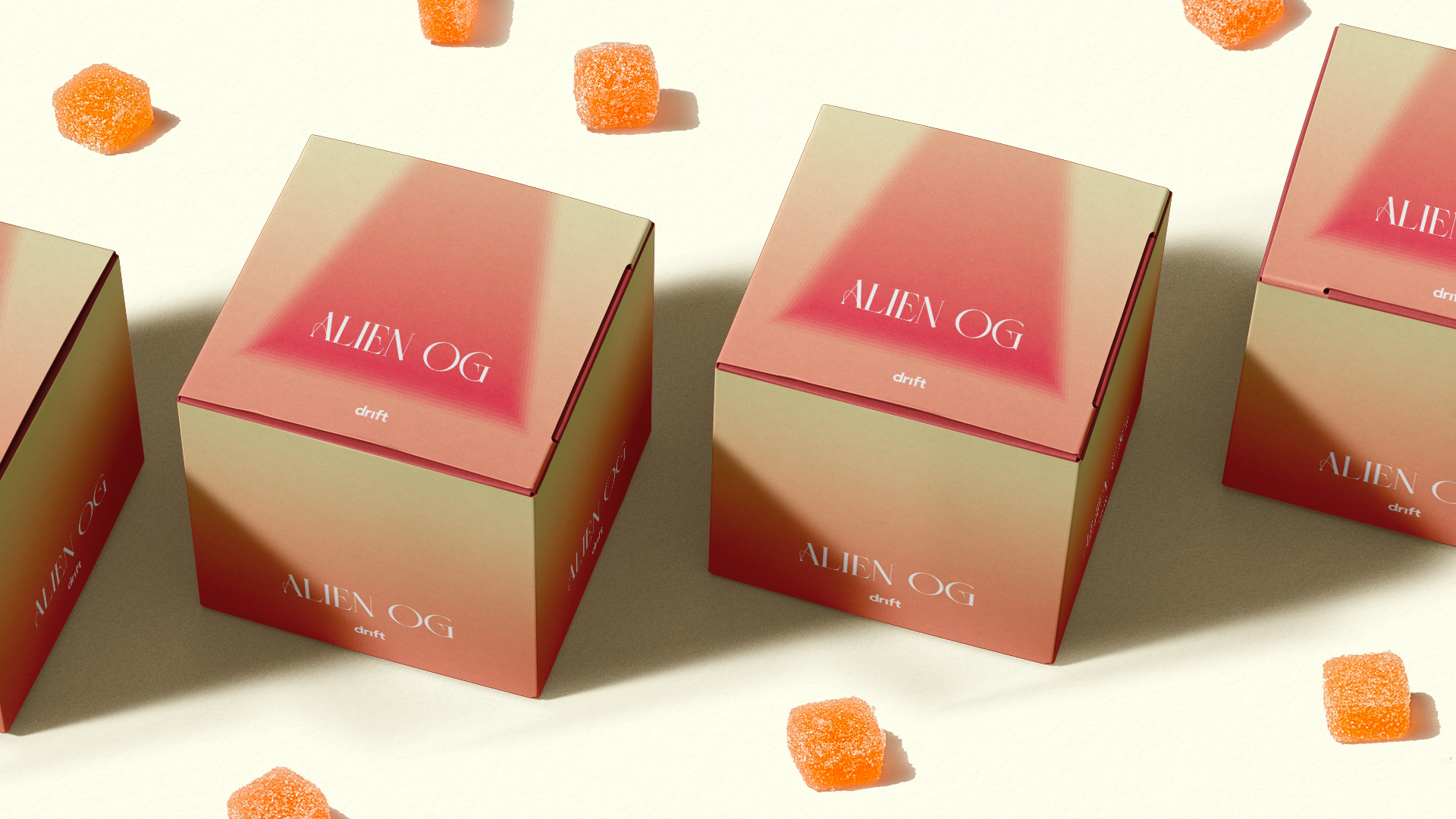
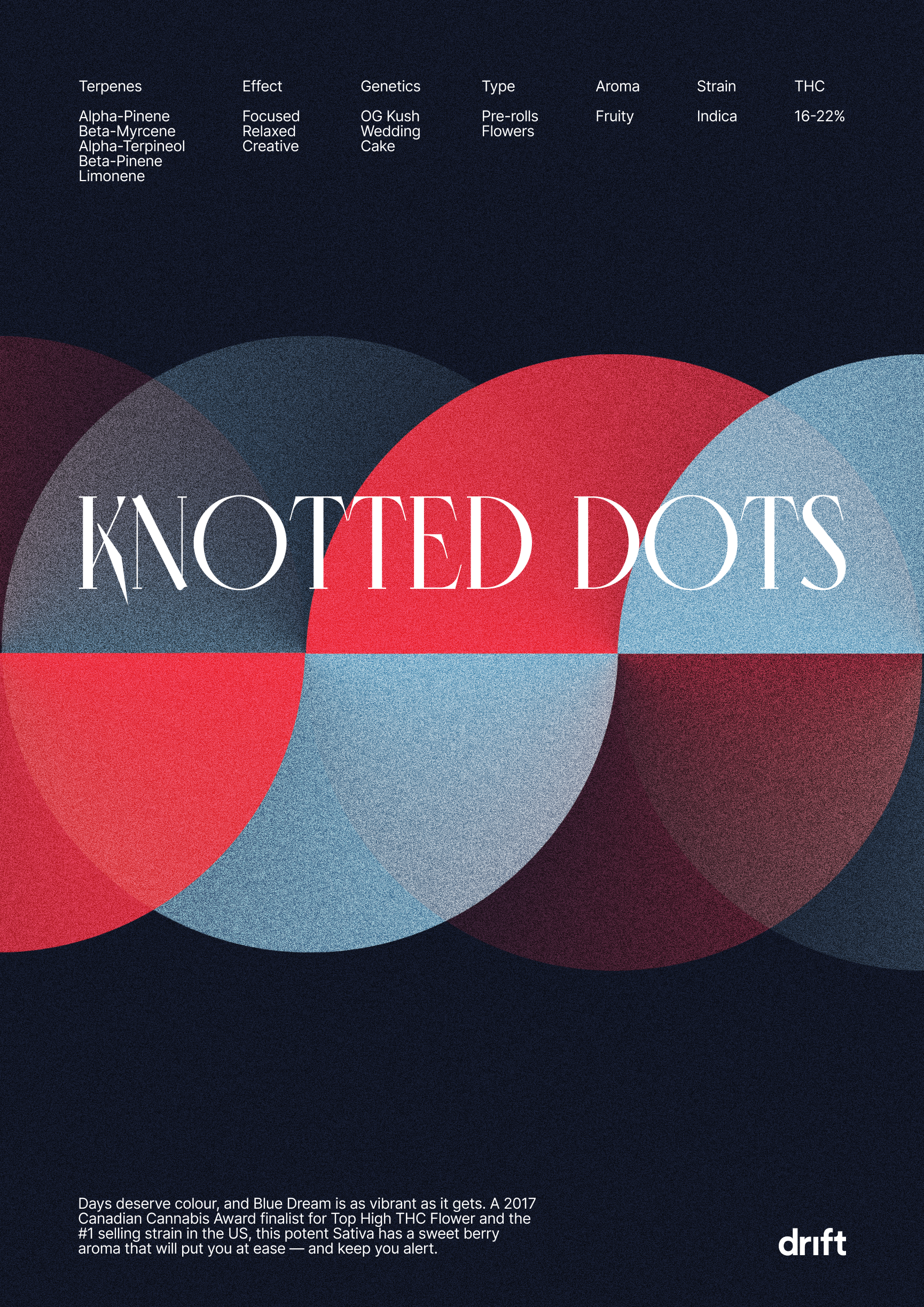
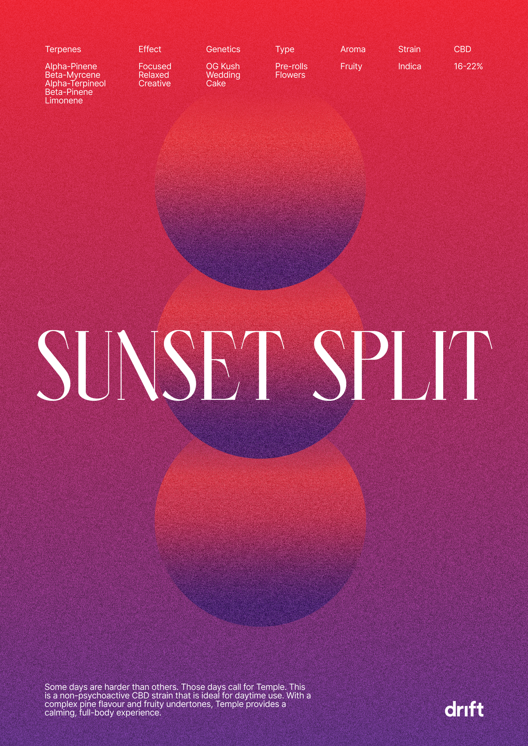
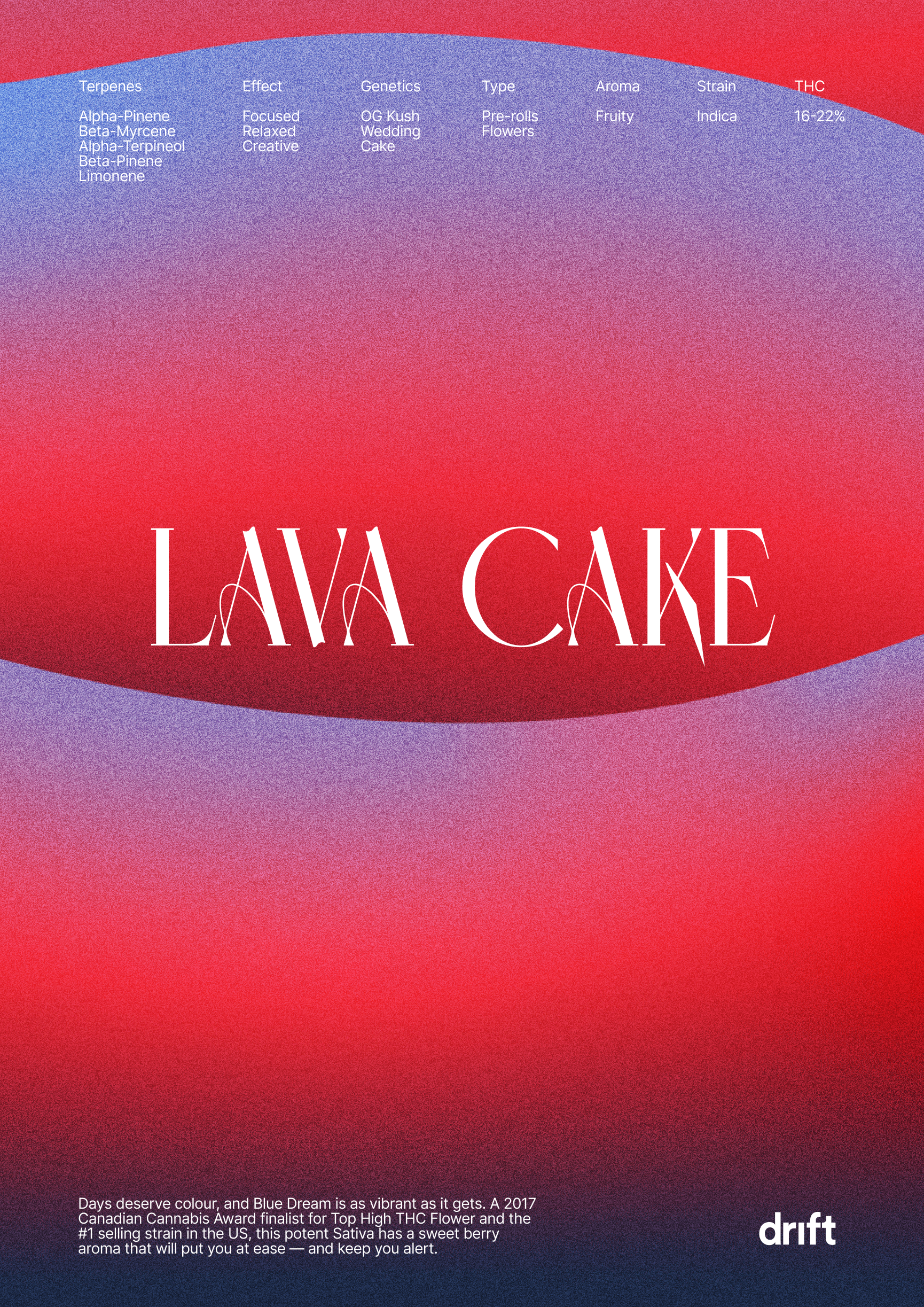
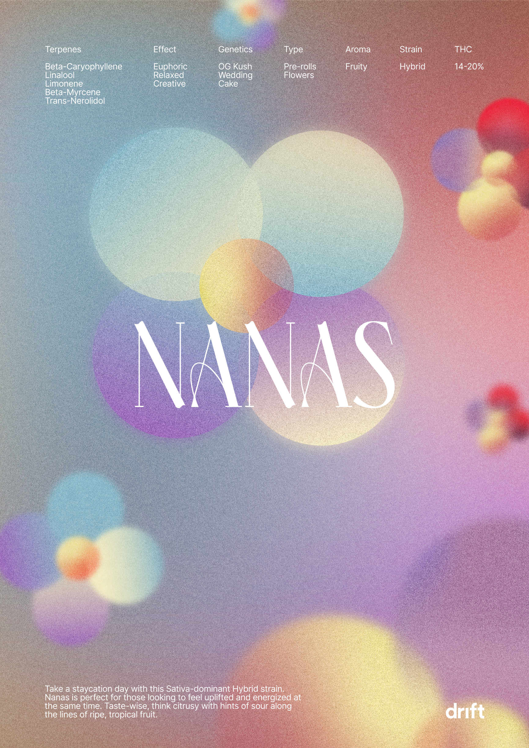
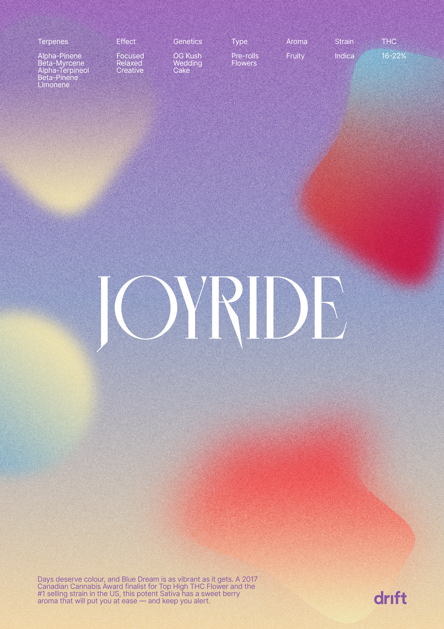
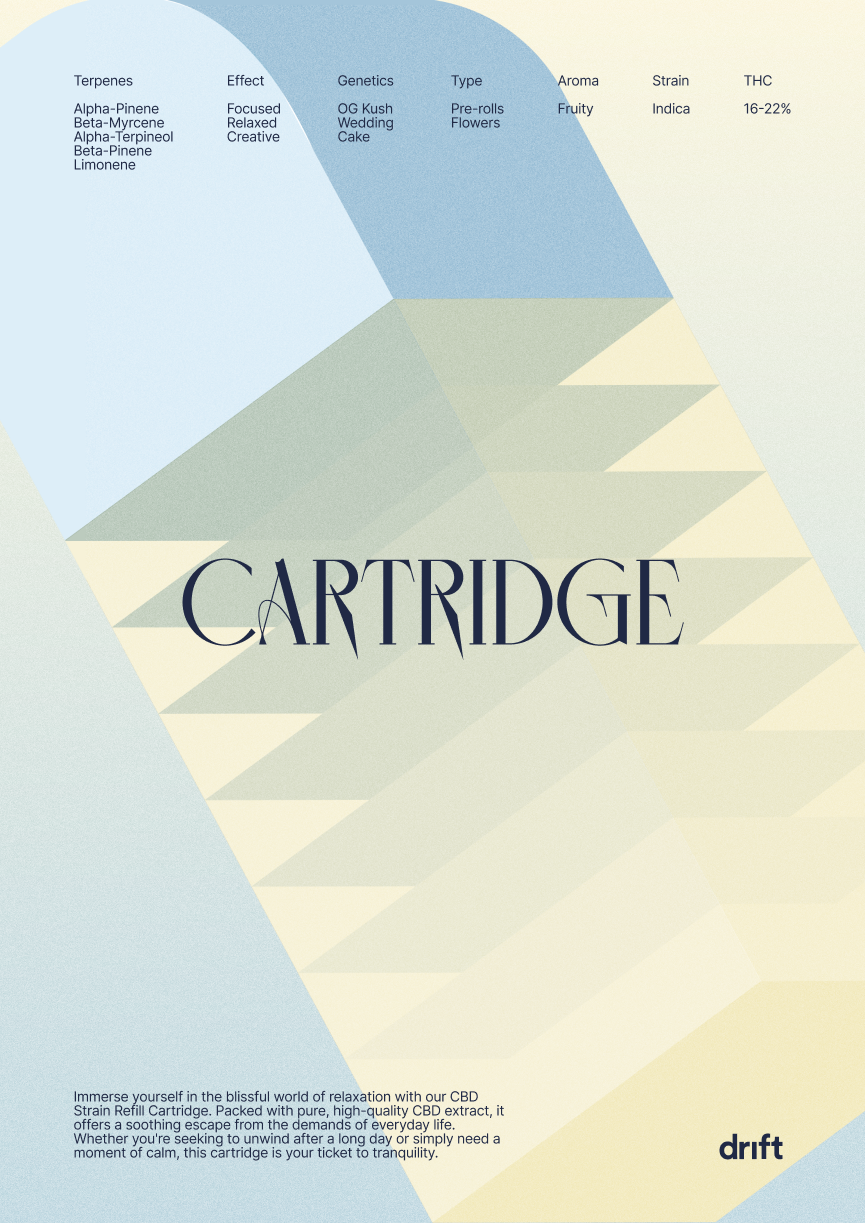
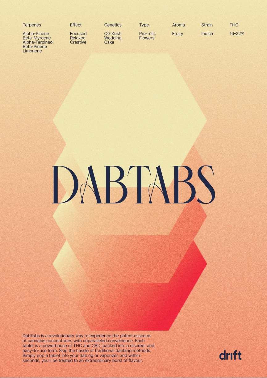
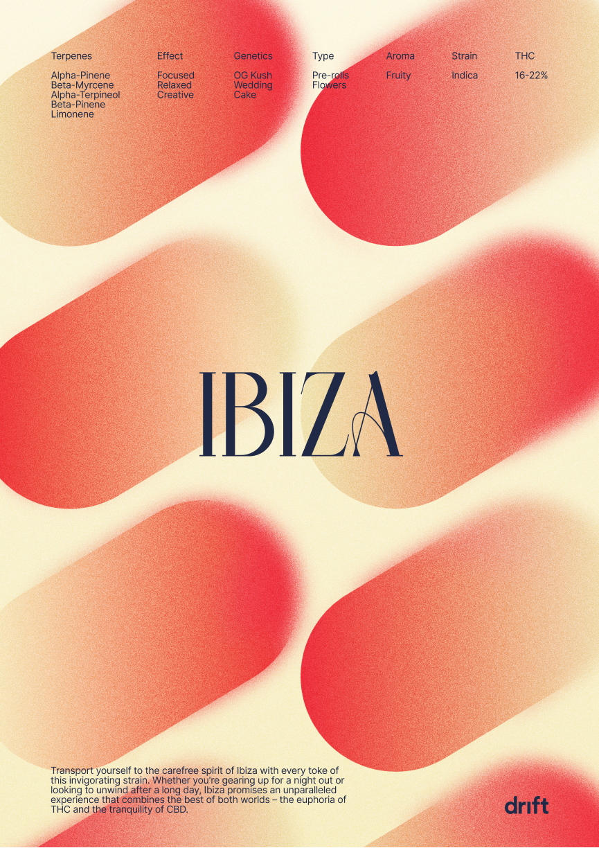
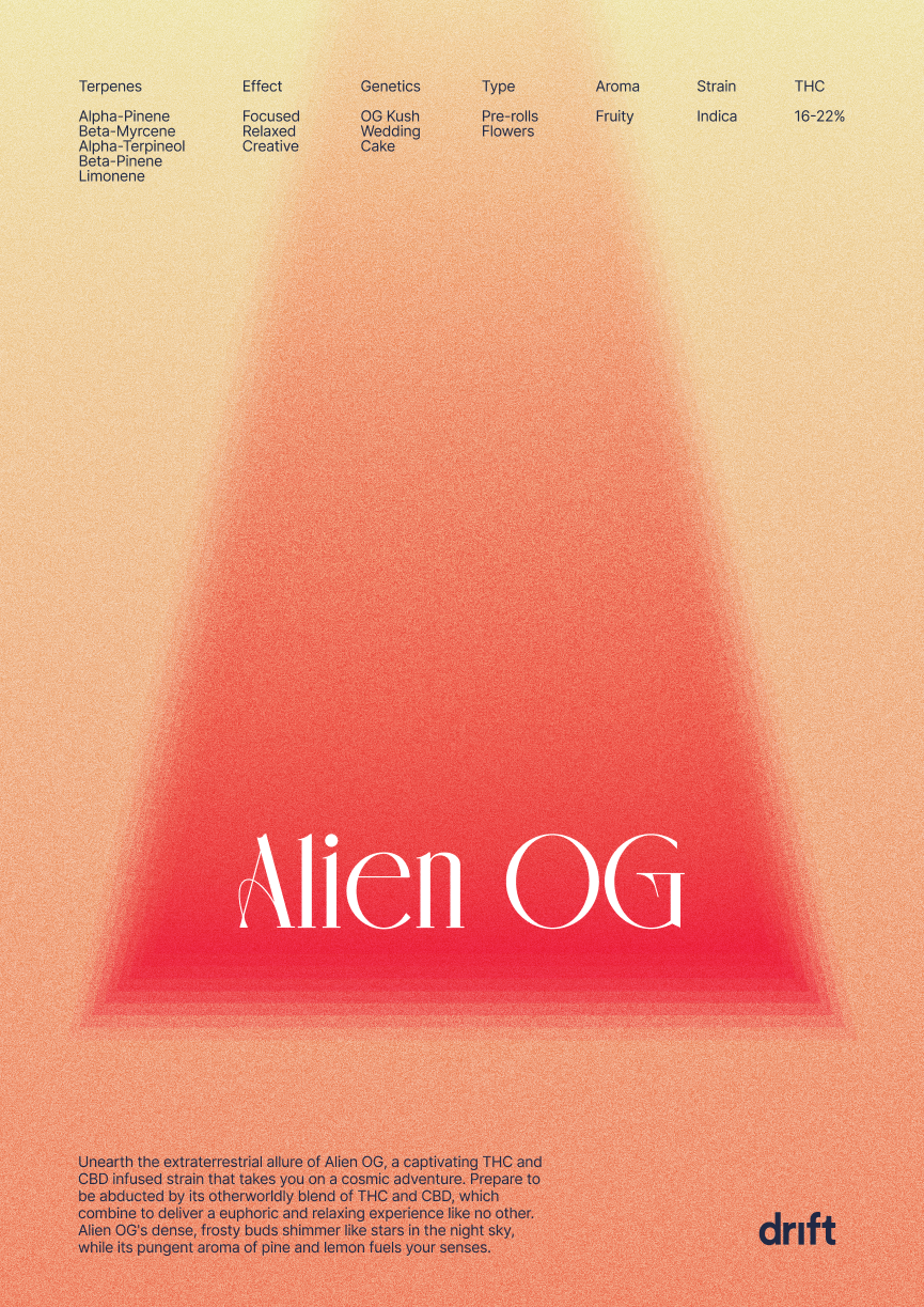
As a solution, we landed on the conclusion that cannabis affects everyone differently, and it means something different to each and everyone who uses it. We did not try and define what cannabis could do but created an honest representation of it instead through abstract illustrations.

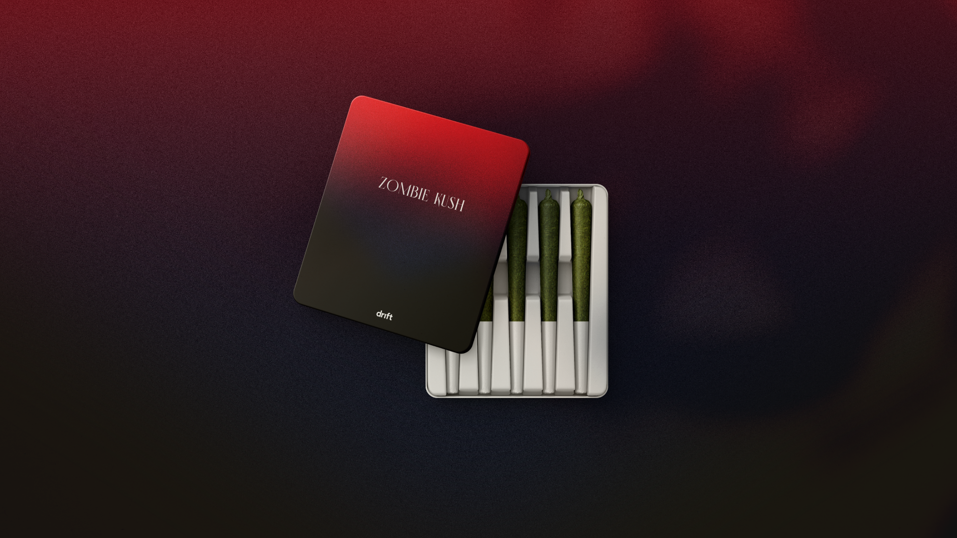
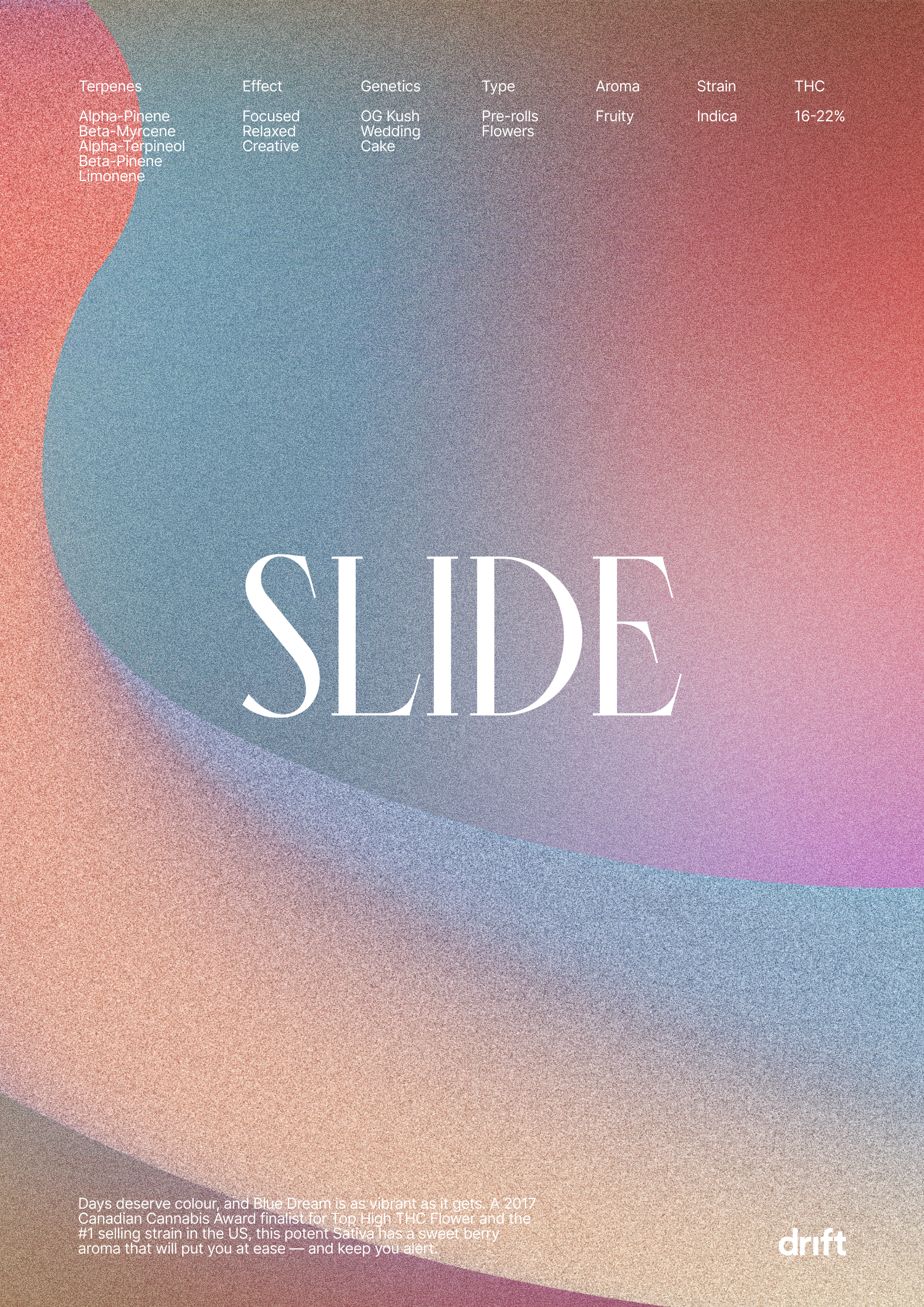
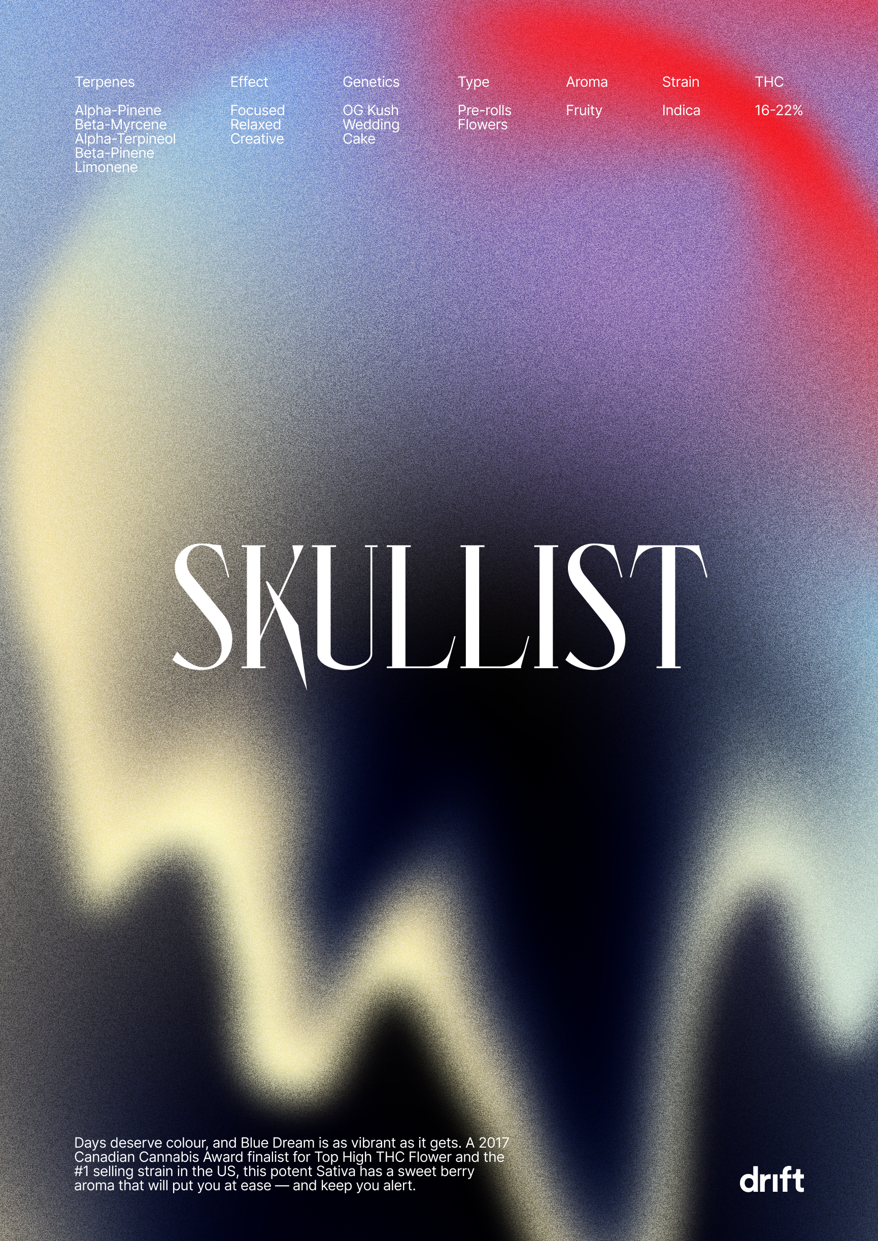
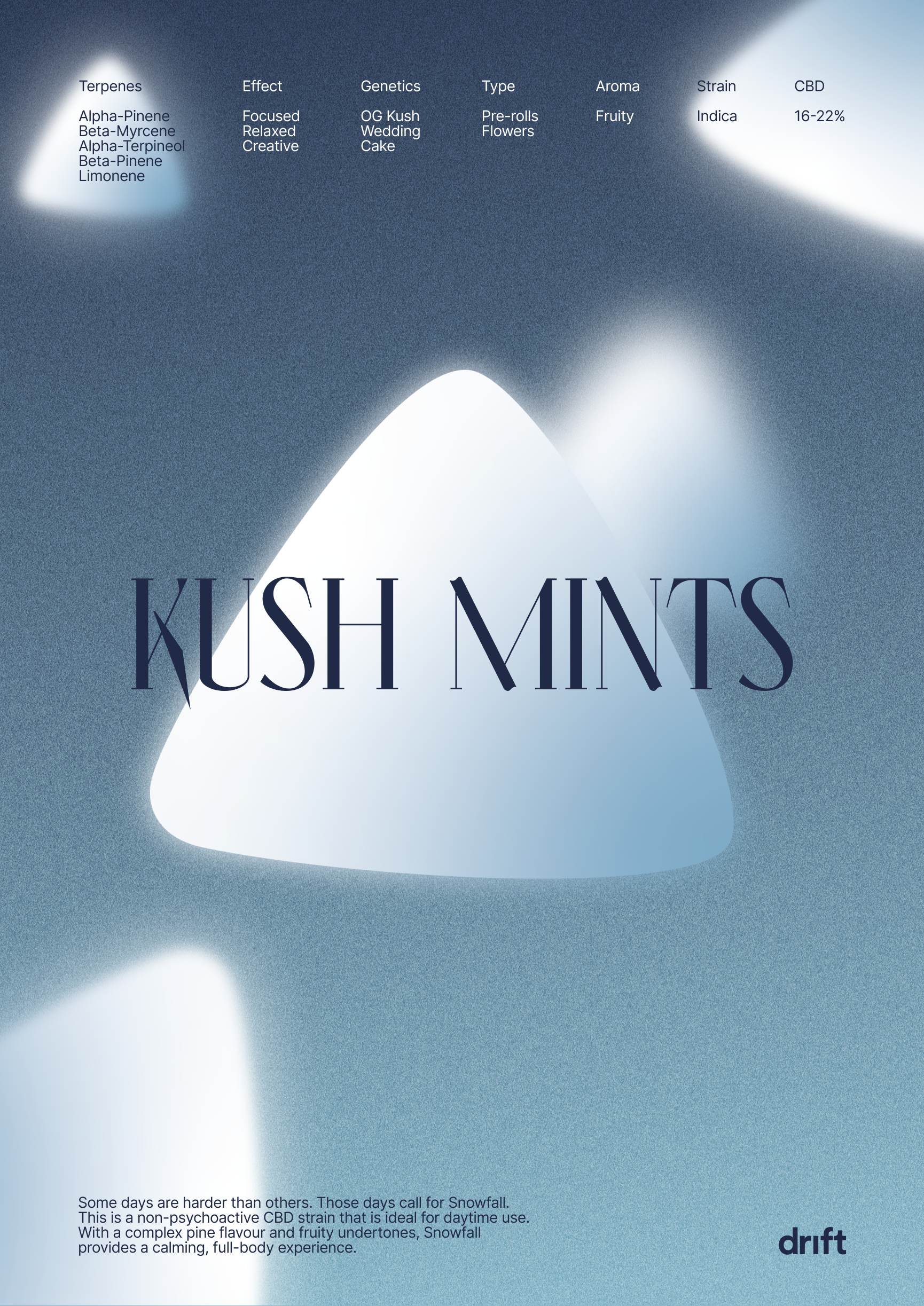
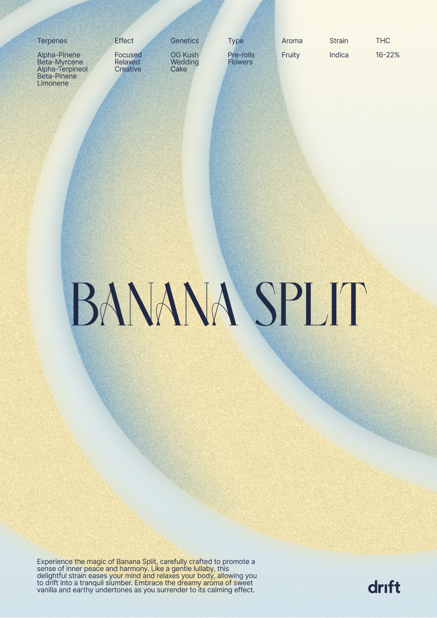
Darker Sativa, lighter Indica
To divide the various products Drift offers, we created a design system that used various colours to represent the three types of strains (Sativa, Indica, and Hybrid). The Lighter colours mean more Indica strains are in the product, showing the relaxing effect of CBD. Darker colours indicate more Sativa strains with more THC levels that cause an uplifting effect.


Credits.
Dane Boaz
Creative Director
Juan Torres
Creative Director